


The warm shades of leather never go out of fashion: what changes is how they are paired. A practical guide to the range in stock.
When talking about fashion colours for interiors the risk is discussing trends rather than projects. This article does the opposite: it starts from the warm shades the catalogue really has in stock and from how they behave next to the materials they end up with in a room.
The earth-tone family
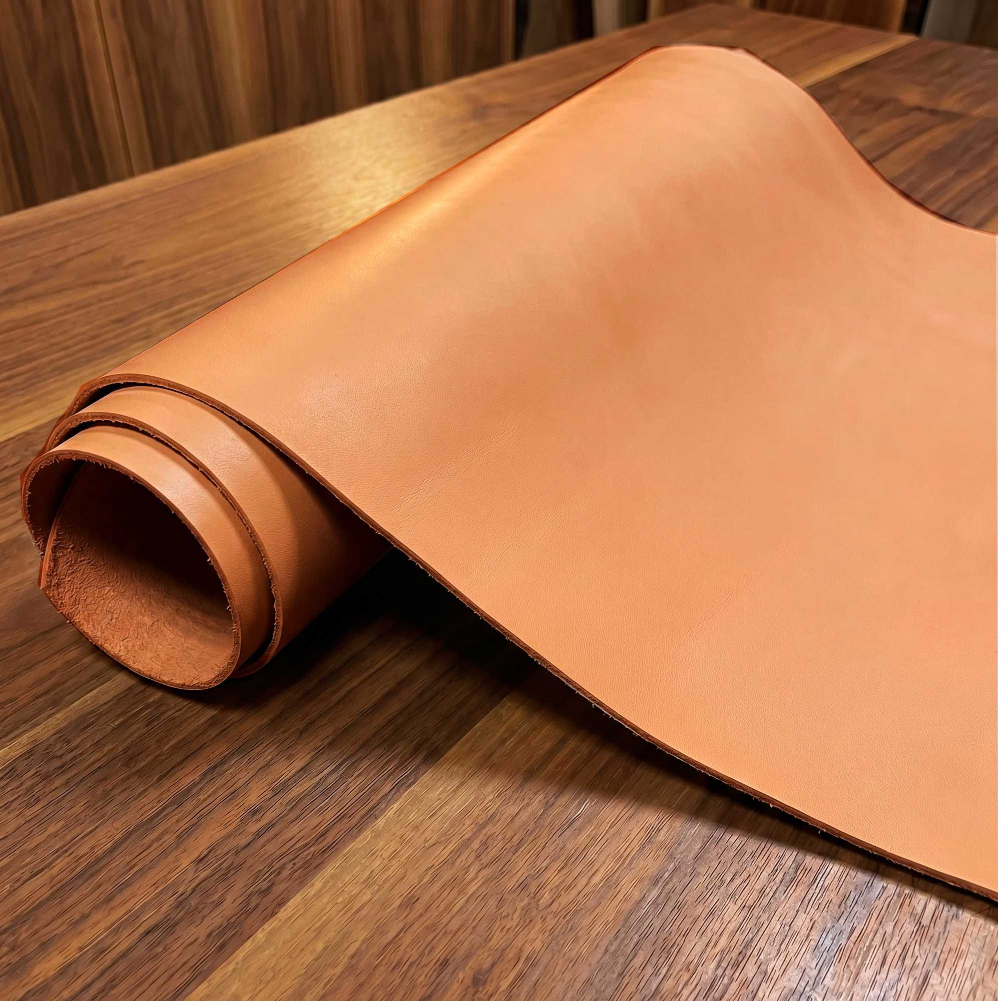
Cognac, tan, tobacco, brandy, caramel, honey, hazelnut: these are the tones leather takes on naturally, and so the ones that suit it best. On Maya leather the warm range extends to Cacao, Dune and Terra; Terra leather works on 4 earthy shades with a glossy finish that makes them deeper; Etrusco leather takes cognac towards the English classic with its pull-up effect, where the tension points lighten by themselves.
The useful thing about this family is that it is never flat: in leather a warm colour reads differently depending on how the light strikes the grain, and that saves a room from looking like a catalogue page.
Fashion colours for interiors: how to pair them
With wood, the practical rule is not to match: a cognac next to an oak of the same tone cancels itself out, while the same cognac next to a much darker or much lighter wood stands out. With brass and warm metals the opposite risk is redundancy — if everything is warm, nothing stands out: a cool element works as a counterpoint, a grey, a deep blue, a stone.
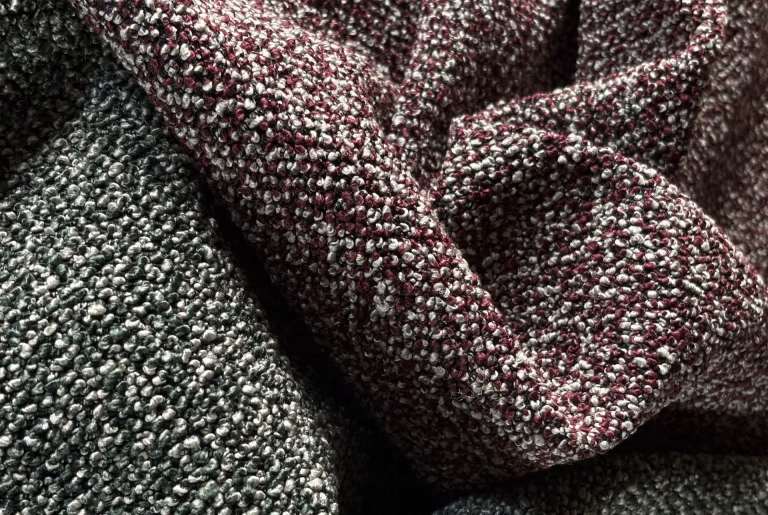
With neutral fabrics the soundest pairing is still the classic one: a seat in warm leather with curtains or upholstery in sand, hemp or light grey, which leave the leading role to the leather.
When solid colour is better
Not every project wants earth tones. Where a bold accent is needed, a solid-colour leather takes the lead: a red, a deep blue, a bottle green on an armchair, a headboard or a pouf — the one piece that is meant to be looked at. The rule here is restraint in numbers: one strong piece per room, not three.
Practical advice
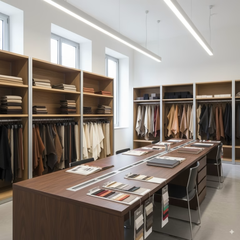
A colour should be chosen in the light it will live in, not the light it is viewed in. Take a sample into the room, place it where the furniture will stand, and look at it in the morning and in the evening: warm shades are the most sensitive to the temperature of artificial light, and a caramel under a cold lamp turns into a dirty grey. Shades can be compared in browse by colour, and samples can be requested from the sample moodboard.